CASE STUDY: MEDICSANA – DESIGN + DEVELOPMENT
A design language system is a system or rules and frameworks that ties the user experience of a product together. For a while, the bread and butter for large design agencies was helping large companies improve their user experiences by synchronizing their product families with a single, simple set of visual and interaction rules. These were the days when versions of products came out every year or so.
A design language system is a system or rules and frameworks that ties the user experience of a product together.
But the industry is changing. The “lean startup” in business culture and “agile” methodology in digital product development require us to think differently about how we design cohesive systems in constantly moving environments. At MedicSana, we’ve always been a company with design in our DNA, and have spent the last 9 months adjusting our process to balance building a cohesive design language with the weekly push and pull of development.
This is the second part of a three part series about MedicSana’s dynamic documentation practices. In Part I, The Documentation Overview, I discuss three rules of effective design documentation:
- The goal of documentation is effective communication, not artifacts
- Documentation should be dynamic
- Think in frameworks, build tool kits
Here, I will talk about how to apply these principles to the longer-term aspects of a product. In Part III, Stories, discusses the way these standards facilitate faster User Story sketching.

Standards aren’t blasphemous… if you handle them the right way.
“But wait… in our fast-moving business environment, we don’t have time for documentation – we need to be always moving!”
The goal of standards is to save time, not waste it. The first step toward setting up your documentation system is to make a distinction between product components that are going to be one-off (such as a certain error modal that only appears in one place) and things that will be used over and over again (such as the overall patterns that all modals should have.
A good rule of thumb is to ask yourself: is this information that someone will honestly need to see after our sprint is over? If the answer is yes, it probably belongs in the documentation – it is a waste of time to explain these things over and over again, so it is better to spend an extra minute to jot some notes down in the beginning. If the answer is “no” – we can simple create some minimum viable documentation for the User Story and call it a day.
I’ve generally found that “pages” – particularly pages that will have different states – are worth documenting while “flows” tend to be one-time use.
What do we standardize?
Standards are patterns that emerge in a system that should be kept consistent. For the MedicSana documentation, we created standards for 3 things:
- Visual Design Guidelines
- Components
- Modules
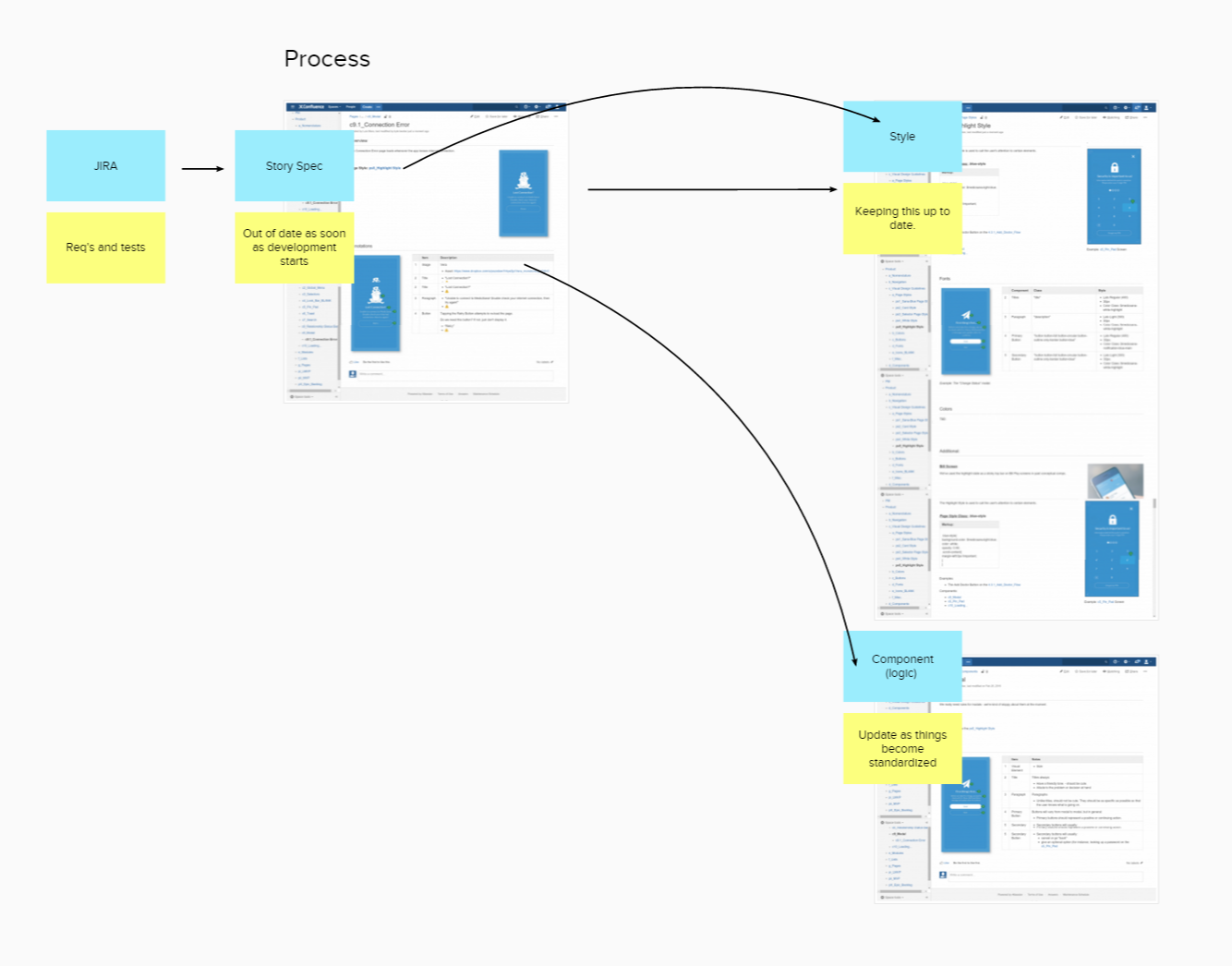
Before breaking into each one, lets take a look at how we documented a user story in confluence. This screen shot is part-way down the page for a User Story we worked on in one of our sprints.
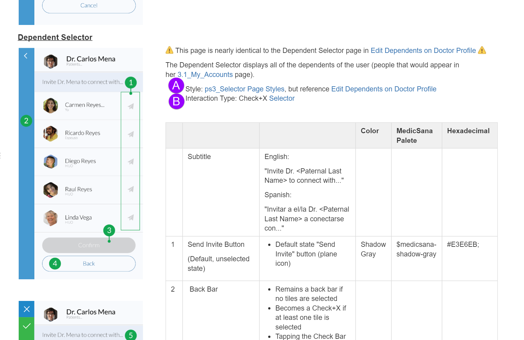
The User Story itself enables the user to accomplish a certain task – in this case, connect the user’s family members to a doctor. The (green) annotations on the page discuss specific interactions in the story, I’ll describe these more in Part III.
To save space, though, and avoid re-generating code, we reference the (Purple -A) Visual Template of the page and the (Purple -b) “Component,” or interaction template, for the page.
1. Visual Design Guidelines – (Page style, Colors, Fonts…)
What does it look like?Visual Guidelines refer to the aesthetic design qualities of a page.

Visual design is the most natural of the three for keeping standards. Generally speaking, designers need time to develop a visual design language, and things inevitably change over time. When we use rules to compartmentalize visual features, it becomes easier to cascade changes through the system. At MedicSana, we kept our Visual Style Guide as a separate section in our wiki divided into:
- Page Styles – a collection of colors, fonts, and spacing rules that would be used in multiple places in the system.
- Colors
- Buttons
- Fonts
- Icons
- Misc (including some components such as “text fields” and “Toasts” or interface specific elements such as “Relationship Status Bars”)
The goal of visual design guidelines is to make it easy for developers to write clean, organized code. Design Language rules should be reflected in the code’s “classes,” so that we can easily communicate with one another.
For example, we identify both names and hex codes for colors we use in the system. After developers create a class for the color, they update the wiki page with the class name so that future story documentation can be referenced.
Page Styles
Page Styles group a host of visual elements (colors, fonts, etc…) together to form a template that can be used in many places.
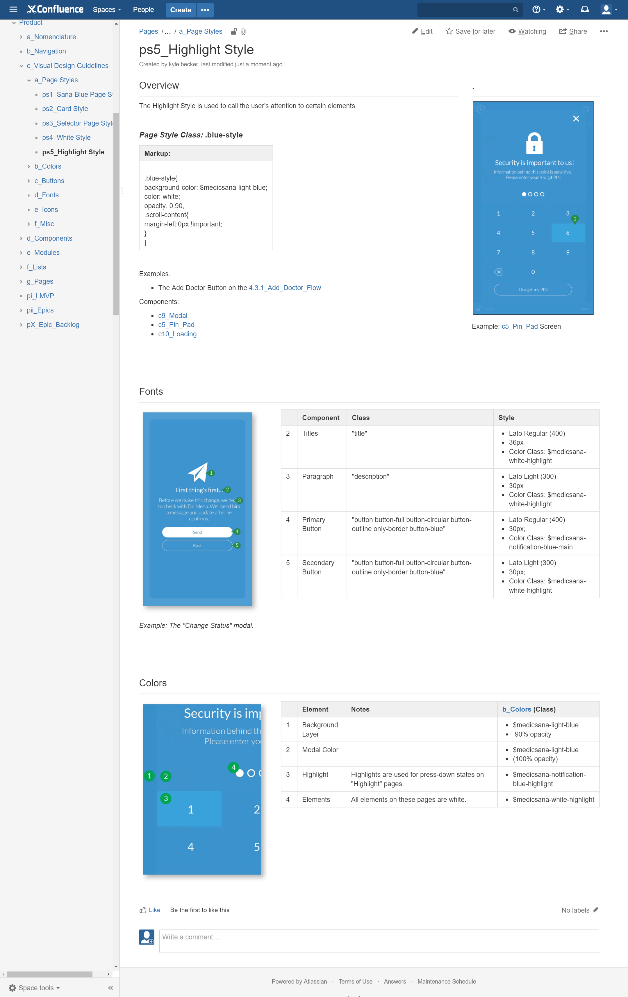
For example, we created the “Highlight Blue” page style for elements in our system that demanded the user’s attention. On the wiki page, we outlined when this style is used, the markup from the code, and some links to examples of where the style is used.
We then include information about fonts and information about components (such as the size of an image or the difference between “Primary and Secondary” buttons.
In our Story Documentation, if we create a new page, we can simply note that it uses the “Highlight Blue Page Style” to save ourselves the time of re-writing all of the information.
Misc. Styles
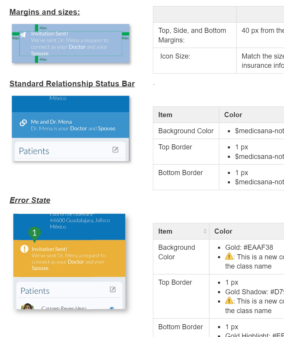
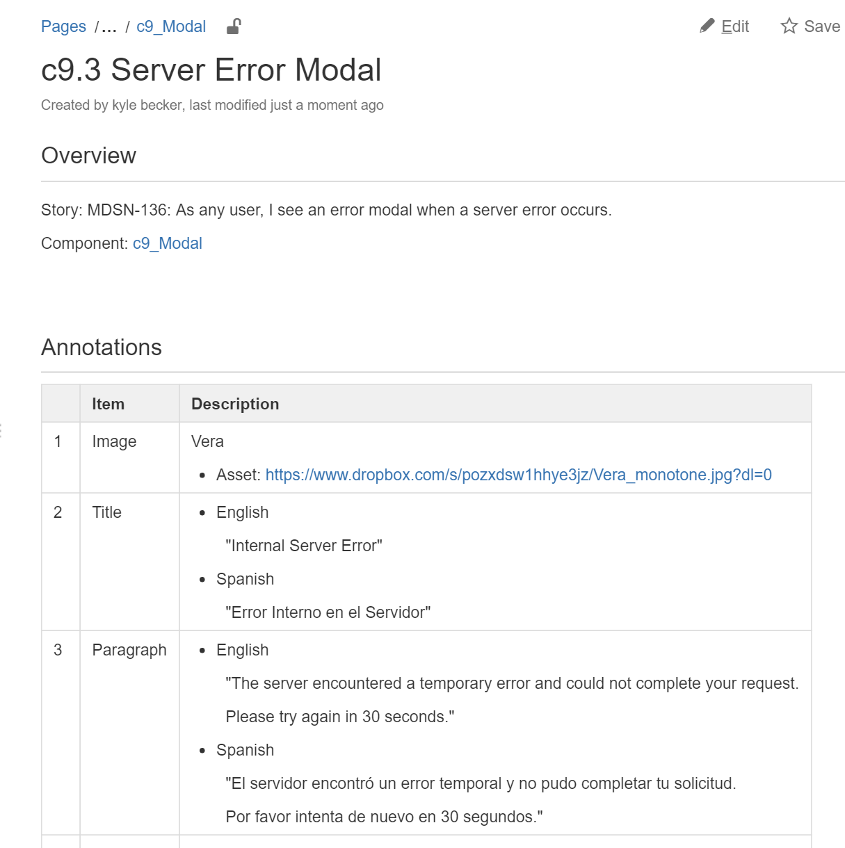
In one story, we needed a new way to visualize an element that sometimes needed to call attention to itself (error state) and sometimes needed to show a pending state. For this element, we created a new wiki page for our documentation and included all of the visual information within it.
Note that this screen shot references colors that do not have classes yet in the code. After our front end developer finished this user story, he went back in and added the new color classes to the documentation on the “Color” page of our wiki. In an agile development process, the DLS is always a work in progress!
2. Components (Modals, Toasts, etc…)
How does it work?Components are reusable interaction elements that are used for different purposes in the system
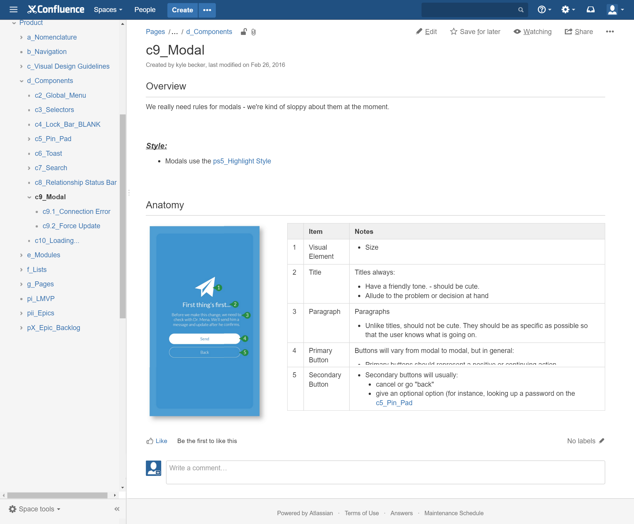
At MedicSana, we used the term “Component” to refer to patterns in function and interaction. Examples included: Pin-Pads, Toasts, Modals, Error screens, etc… A component page in our wiki specified:
- Which “page style” would be used from the Style Guide
- Standard animations, interactions and behaviors
- Text boxes and voice
Each of our components – like all things – grew and changed dramatically in the beginning, but settled into standard patterns over time. Once they did, we were able to save wire framing time by simply writing the requirements for the new variation instead of wireframing out every instance.
For instance, the image on the top left, our “Modal” component page, specifies 5 components on the typical Modal page. Later, when we were working on the requirements for the “Server Error Modal” user story, no wireframes were needed – we simply added the necessary text changes and visual asset to a specs page and called it a day.
3. Modules (Common Patterns in the System)
What is it similar to?
Modules are reusable functional elements, they are generally a component that is reused in it’s entirety or with slight customization throughout the system.
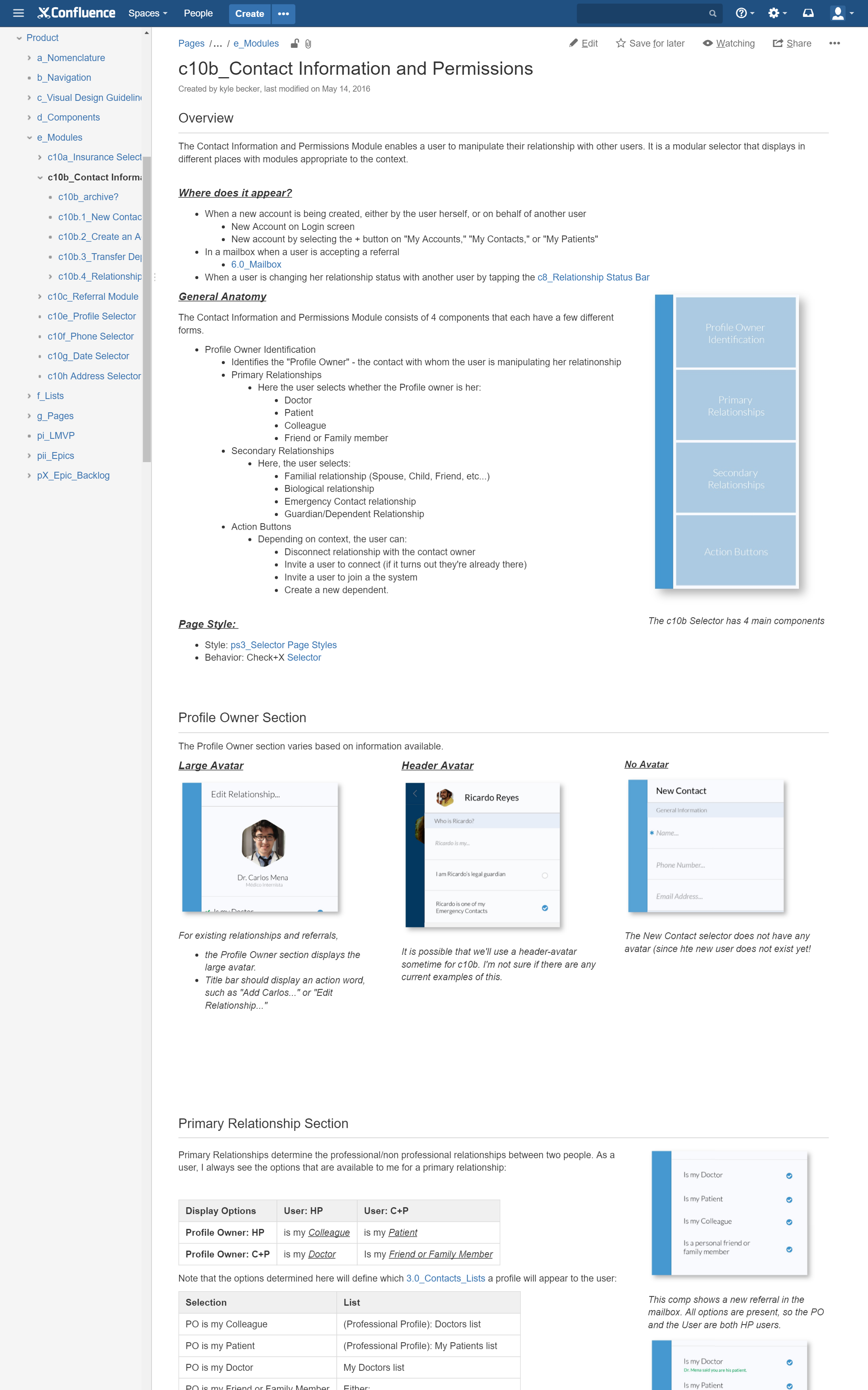
In our system these included Phone Number input, Address Input, Date Input, and other product-specific features. There were no hard, fast rules for what a “Module” was – generally speaking when we noticed a particular component being used over and over again in our system, we documented the pattern and added it to our module section.
A simple example was the “Referral Selector” module. There were many places in our application where a user could “refer” a contact to another user. It would be redundant in our story documentation to constantly re-draw and annotate this common interaction, so we simply reference the same page in our wiki.
Segmenting out modules also gave us flexibility over time as we discovered new dependencies. The MedicSana app had a very simple site architecture, but due to the dynamic relationships (and permissions) between users, quite a bit of complexity when it came to state.
For example, our application enabled users to connect with other existing users, create new “dependent” users, and invite new users into the system. Users could set a “relationship” status setting a familial relationship (brother, sister, cousin), a “professional” relationship (doctor or, patient of, colleague of…), and a permissions set for that relationship.
Final Thoughts
Like a Product Backlog, a Design Language System is a living artifact that constantly changes. At the beginning of the product cycle the Design Language System will grow quite quickly, and it is worth setting aside some designer time outside of the Sprint to make sure the first iteration of these frameworks will be scalable (though there will always be revision over time). As the product begins to take shape, the DLS will solidify, evolving less often as new user stories or feature sets require new paradigms.
This is a snapshot in time, our process is always evolving. As I discuss in my scrum process post, every team and challenge is different and our workflows should reflect it. In Part III, I’ll discuss how we reference these standards in our more fluid User Story Documentation. Or head back to the project homepage to view all of my posts about MedicSana, Inc.
Read More
Read more about the MedicSana project, other design case studies, or more about me on my homepage.