CASE STUDY: MEDICSANA – BRAND
In this post, I outline some artifacts of the MedicSana brand presence, including our name, logo, slogan, and Vera, our mascot. These fit within the context of an overall brand strategy that was founded in our research interviews.
To learn more about the background behind these artifacts, check out my other write ups on:
- The MedicSana Brand Strategy
- Our Research Interviews with Remittance Senders
- Our Research Interviews with Doctors in El Salvador and Mexico
Or head back to the Homepage for more articles about the MedicSana project.
Our Name: MedicSana
The MedicSana name – the title of founder Alex Castillo’s original pitch – pre-dated even my own involvement with the project. “Medic” simply and obviously alludes to the vertical the service is related to: healthcare.
“Sana” is latin for health, and in Spanish reminds one of the verb “sanar,” to heal, or “salud,” health. “Una persona sana,” is a healthy person. The word also resonates with any child who, after falling down and scraping their knee has a grandmother to smile and console…
“Sana, sana colita de rana,si no sana hoy, sanará mañana”
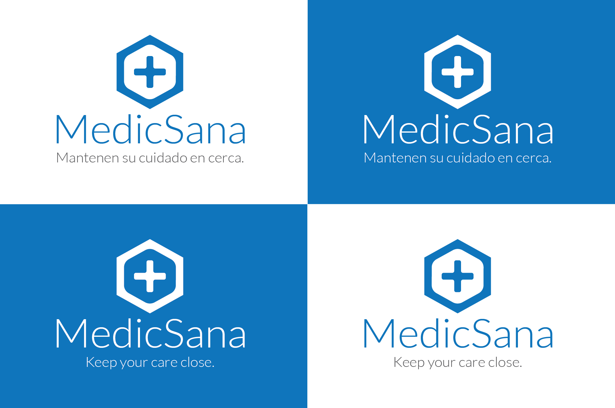
Our Logo
The visual design of our logo was crafted by the skilled hand of J. Pablo García Bucio.
The concept of our logo comes from a conversation with one of our doctor partners in Guadalajara. One of our partners, Jona Barcelo, was down in Guadalajara, Mexico at the local Asesores Medicos hospital talking to Dr. Gabriel Morales about our research findings in the US. In particular, we had found two key use cases:
- The normal cadence of a family revolved around pay day: most families sent back a certain amount of money on a regular basis (sometimes monthly, bi-monthly, or weekly) with the hopes that their families would spend it on things they needed (food, shelter, education, and, of course, healthcare).
- In an emergency, the family – generally led by the family’s organizer – would jump into action, everyone sending the money needed proportional to what they were able to send. In many cases, the Carmens of a family will know about how much everyone makes – and knows if you’re being cheap!
Dr. Morales smiled when Jona told him about the emergency situation, “Its like a Caja Popular!”
A caja popular – or “popular box” – is a box that is passed around a small community when someone really needs help. Everyone contributes what they can to the box to help out with the emergency.
When Jona came back to the US, we decided our business model would focus on these two situations:
- Cajas Fuertes – “strong boxes” or “safes” would be linked to a person’s account and enable family members to contribute money specifically for healthcare – similar to an HSA in the states.
- Cajas Populares – “popular boxes” – would be attached to an actual patient bill. If a doctor issued a bill to a patient in our system, anyone in the family would be able to contribute to paying it off.
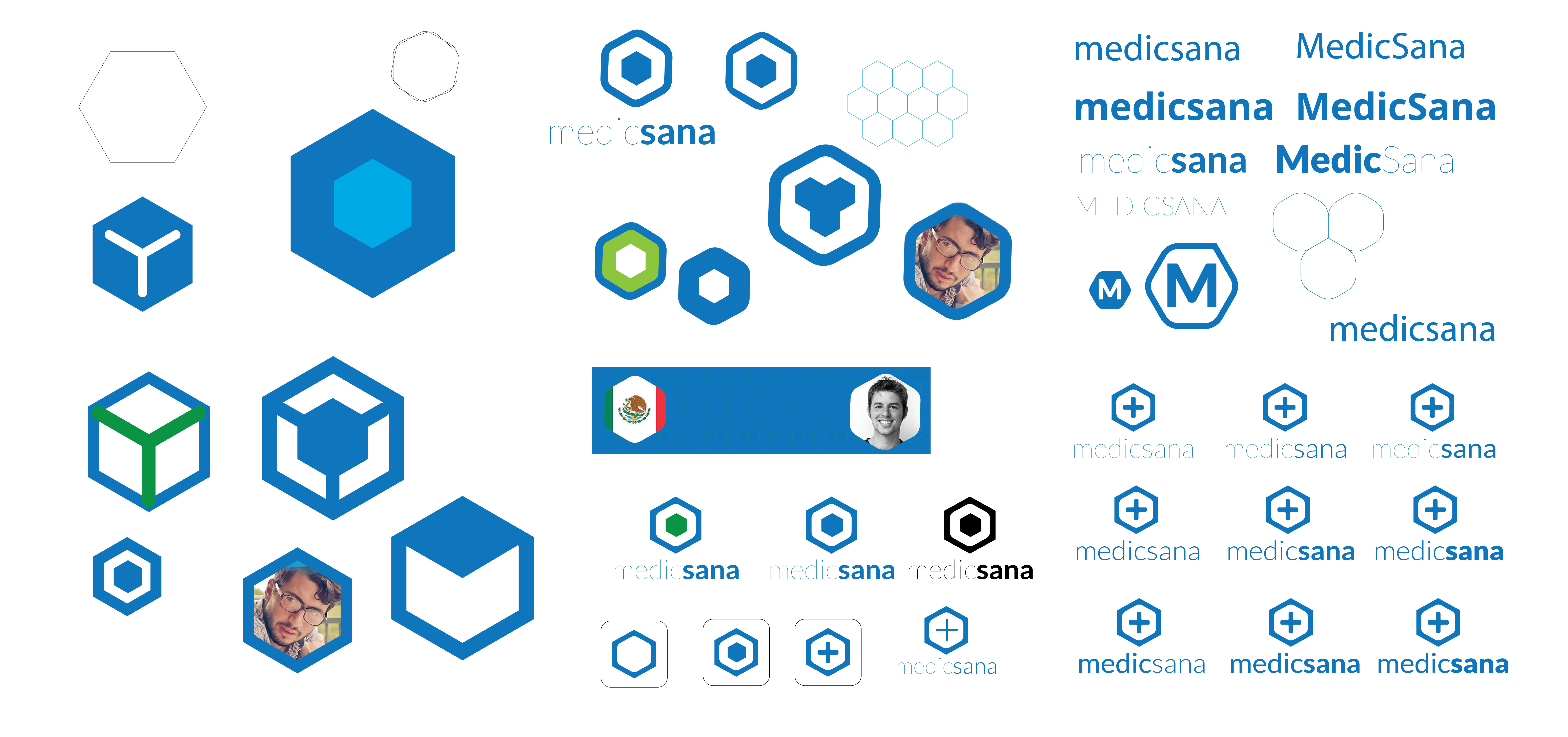
When we explained the concept to Pablo, he started experimenting with the box shape. We iterated for a little while to come up with our logo:
- A hexagonal shape to allude to a box;
- Geometric and strong on the outside to nod to the security of our system;
- Soft on the inside to reflect the care or the community and the family;
- A cross for the healthcare aspect, and a nod to the religious duties that many feel are essential to care as well.
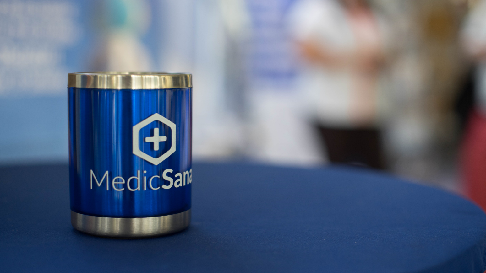
Our Slogan
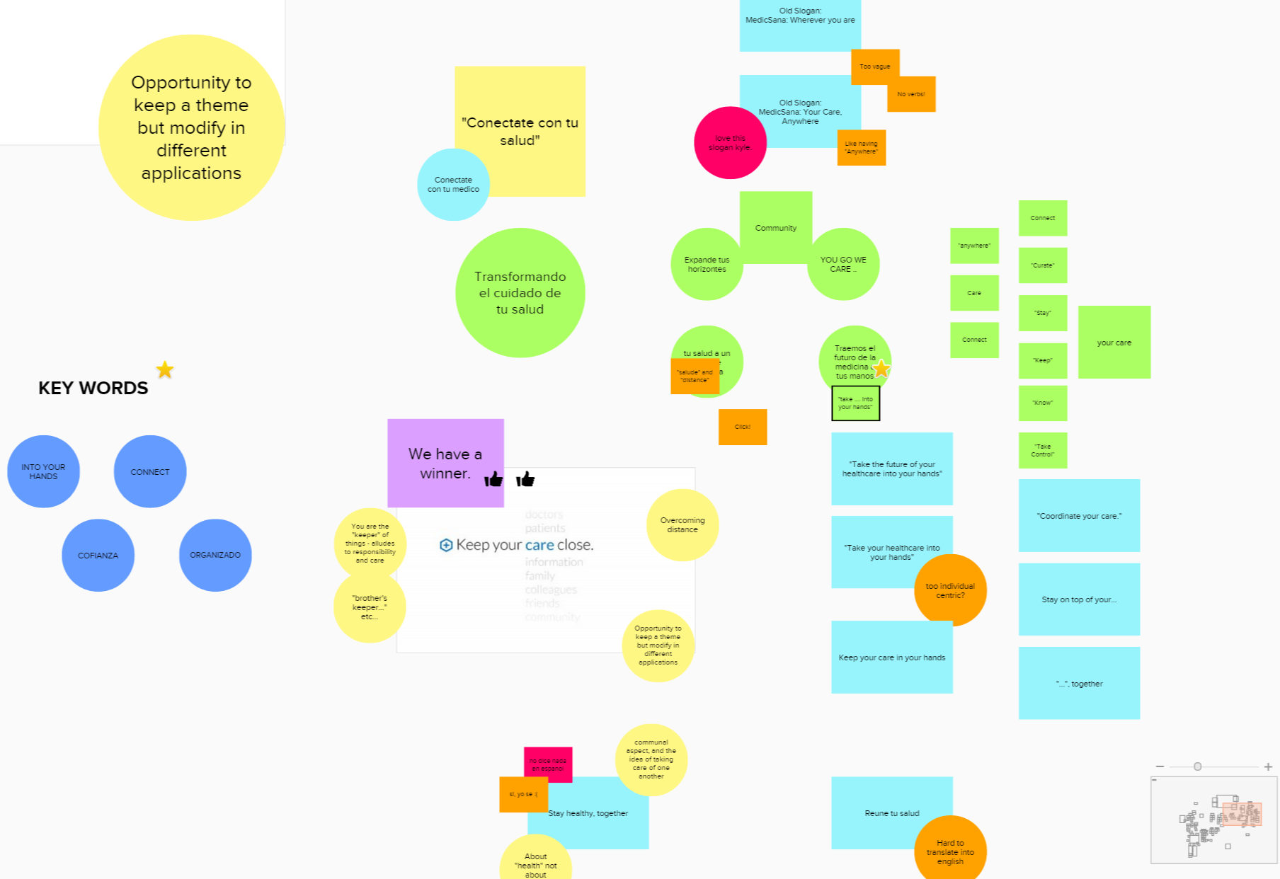
Our name and logo were decided early in the MedicSana development, but our tagline didn’t solidify until much later in the process when we’d brought on our talented Salvadorean marketer Indira Flores.
By this point, our tagline presented a bit of a challenge. Our early research had been with remittance senders in the US, and our working tagline used in our video (English)(1), “Anywhere you are,” or “Your care, anywhere,” specifically targeted distributed family members. Our challenge now, however, was to market to doctors in San Salvador – we needed something that would be able to speak to patients, family members, and local doctors.
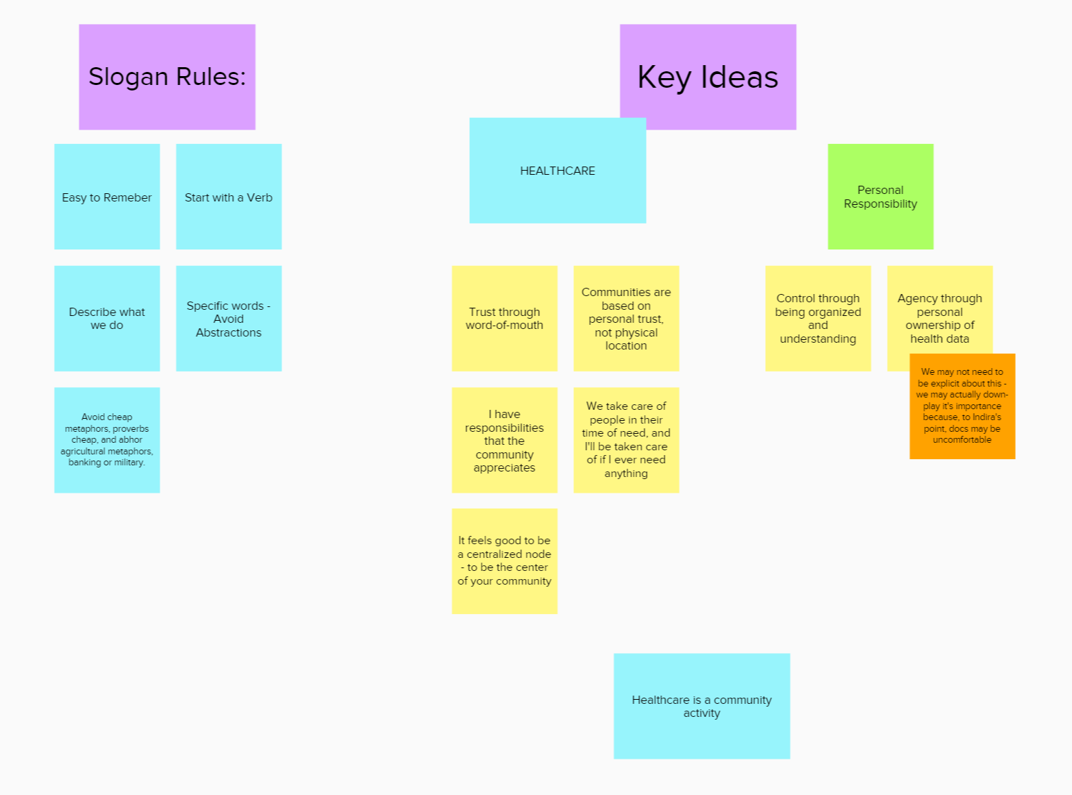
We built an online idea board in Mural to have our discussions around. Indira prepped us for our brainstorming sessions by providing some slogan rules, and I spent a little time pulling together some examples of good slogans that we could gather inspiration from, and pulled in one of my favorite brand frameworks – the 12 Archetypes from Mark and Pearson’s The Hero and the Outlaw to frame the conversation.

It took us a few brainstorming sessions with the whole team to settle on the principles of the brand that we wanted. We had conversations about gender (are we a feminine brand, or a masculine brand?), personality (are we caring? Innovative? organized?), role (is MedicSana a solution itself, or a helpful assistant?).
There were a few themes we knew we wanted to keep in mind on the doctor side:
- Its all about personal connections
- The most common theme with both doctors and patients was the close, personal relationship they had with one another. Doctors are well aware of their reputational currency and the fact that – while they are most proud of their credentials – that it is through rich personal relationships that they keep the patients they have and get new referrals.
- Becoming a method of connection was also important in our growth strategy – if word of mouth is the most important way to gain patients, we needed to be the way people connected.
-
We voted up and down until settling on our key brand traits. Not too techie
- While many doctors may like to be seen by their patients as advanced, there was a fear in our doctor interviews around technology that would be hard to train their staff on. Many had bought “innovative” solutions before, only go back to using paper, Microsoft Word, and What’s App for patient management.. To resonate with doctors, we needed to stress that our service helped them have a more human – not technological – relationship with their patients, and that adoption would be as natural as What’s App.
- Exclusivity through reputation
- Exclusivity is important to doctors, but a certain flavor of exclusivity. Many “exclusive” products project their brand though their price-point. We knew that with both a social mission and a need to hit a critical mass in our two-sided market that a high-price play wouldn’t help us. Our version of exclusivity would be framed through the most important factor cited by both doctors and patients: word-of-mouth referrals. (See more about this in our Brand Guidelines document)
- Safe and Secure
- When people talk about safety and security, we often think of proximity. We tend to keep important things – our jewelry, heirlooms from our family, either hidden away or close to us. When we think about personal protection, we also thing about items we keep with us, and the people we trust most.

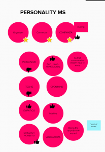
Eventually, we settled on “Keep your care close.” We liked this slogan for a few reasons. From the perspective of an organizer, it means keeping all of the information and the doctor his or herself close at hand – always ready when the family is in need. For doctors, it also means having their patients close. Even when not in her office, a doctor that receives a call (and we hardly got through a single doctor interview that wasn’t interrupted by at least one patient phone call) can instantly have her patient’s information at hand, ready to help.
We believed that the words “keep” and “close” also resonated with the family-centric mentality of our distributed families. Even if their family members are far away, they now have the agency to take care of them.
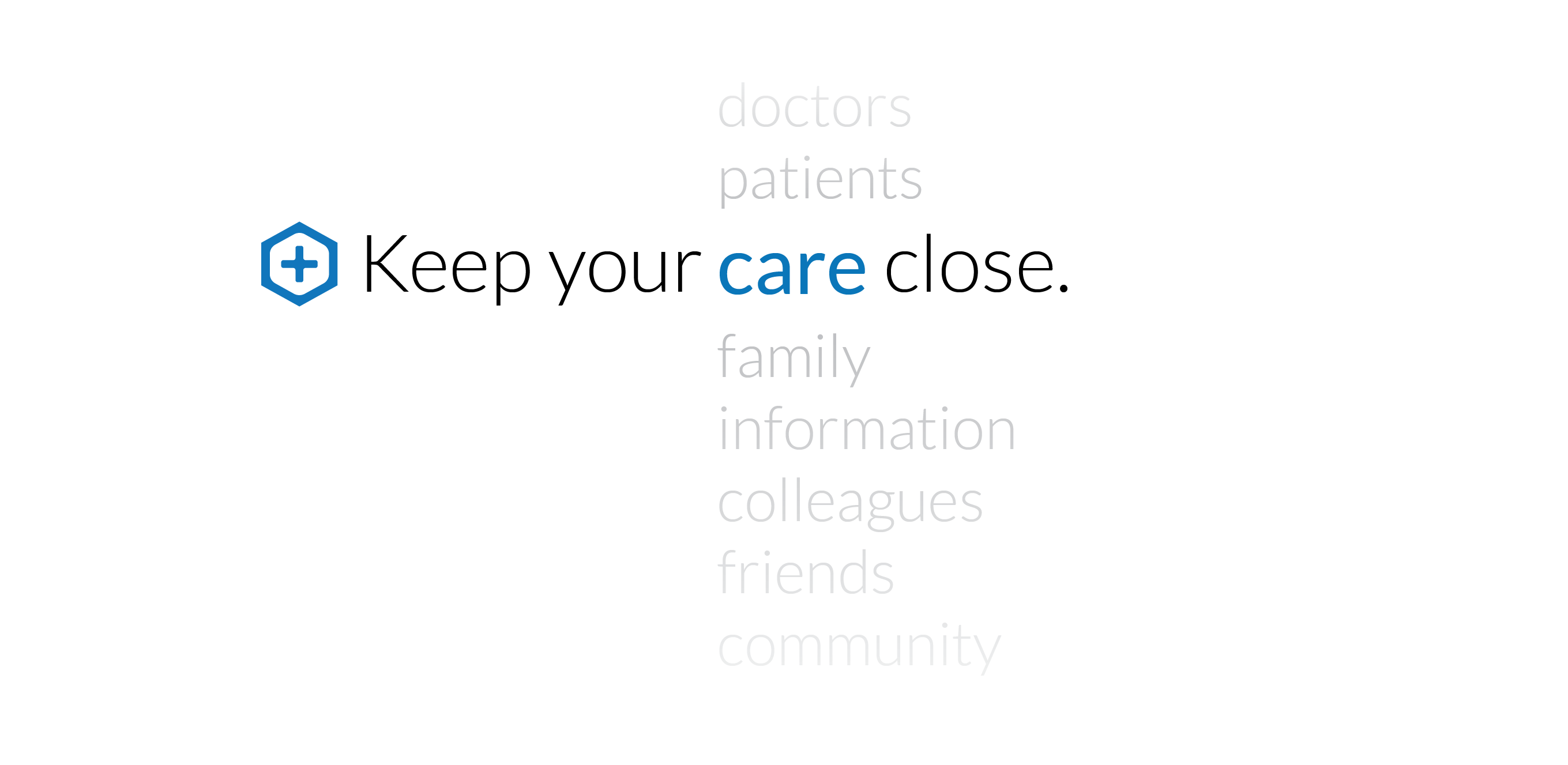
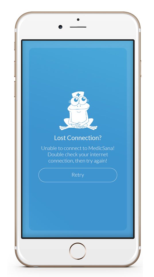
Our Ranita, Vera
 Finally, as a small, but fun part of our brand, we decided to adopt a “Ranita”(2) for brand.
In particular, we wanted a “fail whale” of our very own. We knew that – given the bandwidth constraints of our market, and the fact that we would be launching with a cloud-based web app, that internet connectivity would be a common problem for a little while. As an affinity-saving tactic, “fail whale,” which got it’s name from google’s original 404 Error screen, shows a cute animal and an apology when the system has an error.
We liked ours even better because “Sana, sana, colita de rana…” is something you hear when something has gone wrong, but a little patience will make it better.
(1) The MedicSana video has our original logo in it. I collaborated with Jona Barcelo to write the script, and Jona did the voiceover in Spanish while our co-founcer, Alex Castillo did the English Voice over and the background music. I did all of the drawings, and collaborated with Jona for the shoot.
(3) In spanish, you add “-ito” or “-ita” to something that is small and cute. “Rana” means frog, so a “ranita” is a cute little frog.
Read More
Read more about the MedicSana project, other design case studies, or more about me on my homepage.