CASE STUDY: MEDICSANA – DESIGN + DEVELOPMENT
A user interface is, in many ways, a living artifact that reflects a user’s needs and a company’s ability to fulfill them. As an early stage startup with a heavy emphasis on design, our product development roadmap was as much influenced by business forces (such as potential partners, our relationship with our strategic investors, etc…) as with conversations with our users through design research interviews.
This article talks in about the interface design of our application. The annotations in this post were made specifically for this blog. To see how we annotated designs during the development process, check out my article on our design language documentation.
Initial Minimum Viable Product Design
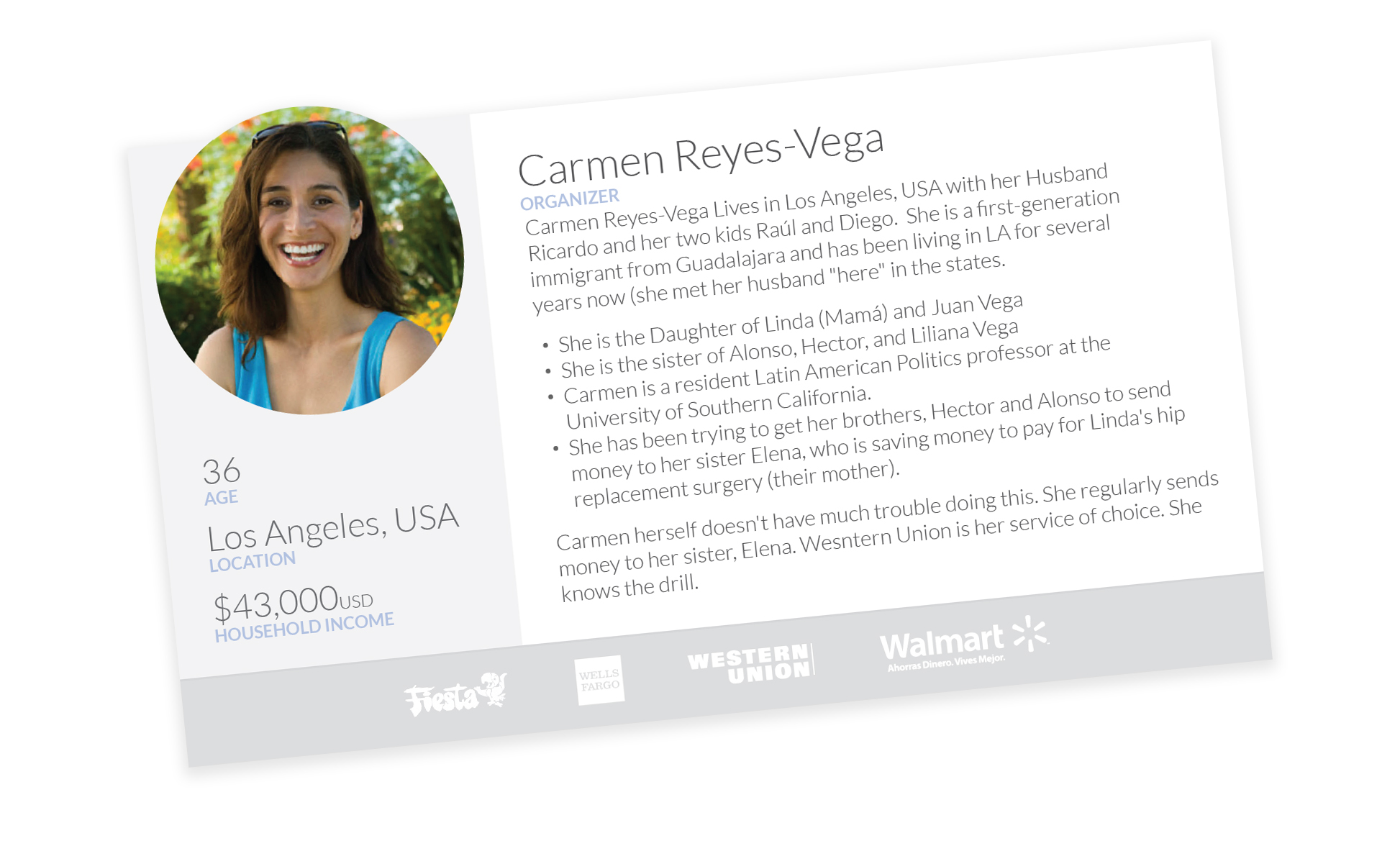
Before a wireframe was drawn, the MedicSana team held design research interviews with Latino immigrants in Texas and created a family of Personas, with Carmen Reyes Vega as our target (read more about our research process).
While Carmen’s overall experience narrative for taking care of her family’s health is a complex sociological web, the window where she will engage with our app is actually quite small – either short engagements that happen regularly or longer engagements that happen infrequently. For this reason, it is best to consider a few different engagement scenarios that have differing levels of depth.
Those 30 Seconds: Shallow, regular engagement
The goal of MedicSana’s user engagement isn’t to maximize time spent, but to encourage regular engagement at optimal times. As a result, we built the following story to understand Carmen’s situation at the critical moment of app use:
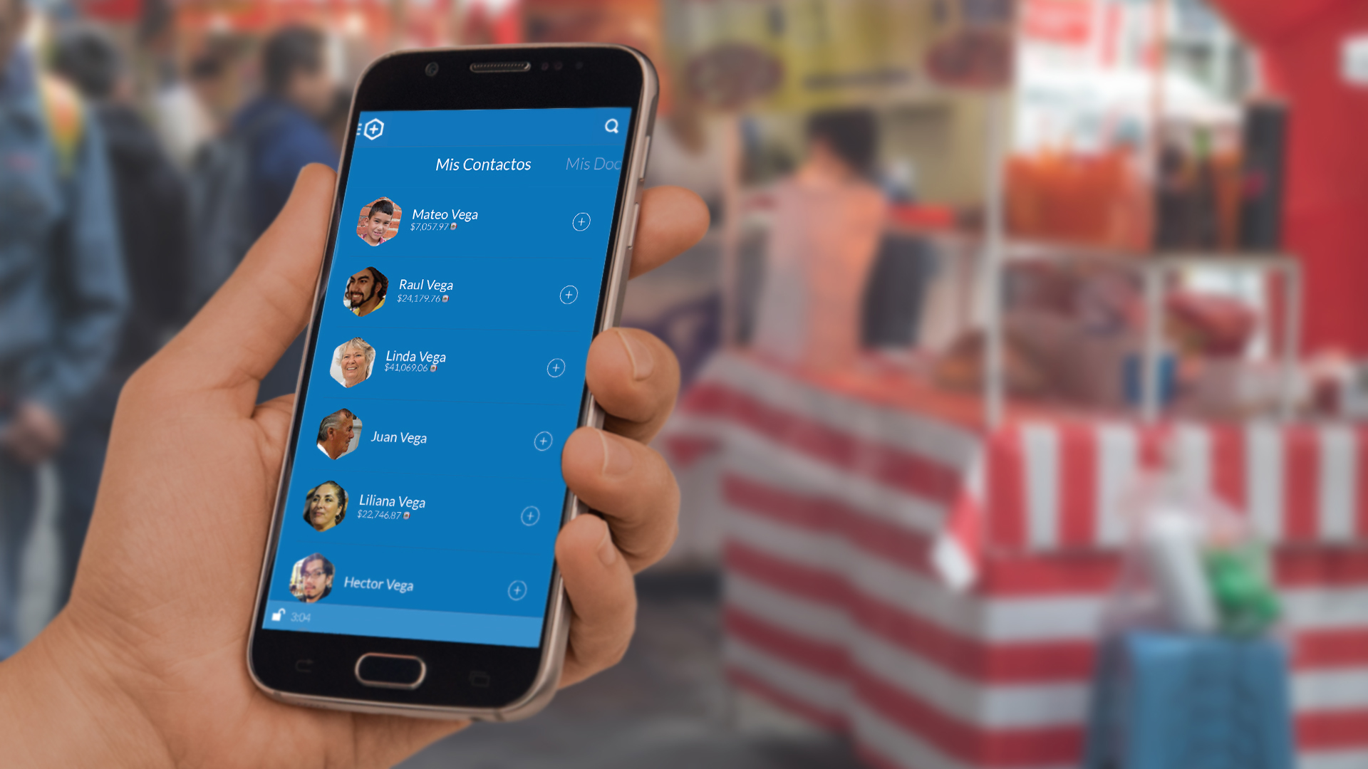
“It is Saturday morning, Carmen and her husband received their pay the day before. Carmen is at the Fiesta Supermercado where she tends to all of the family-oriented tasks that are part of her post-payday routine: puts a little bit of money in the bank, sends some to her sister, her father, her husband’s mother and his niece, top-up her cell phone plan, and buy groceries.”
Our story has some psychological overtones: this is the time of the week when Carmen is fulfilling the quintessential “Caregiver” tasks for her family and the task of allocating resources in a responsible way is top of mind. This is exactly the mindset that we’re looking for when she acts with our brand. Our story also has some pragmatic issues: she is probably pushing a cart, managing at least one child, and she’s likely in a hurry for one reason or another.
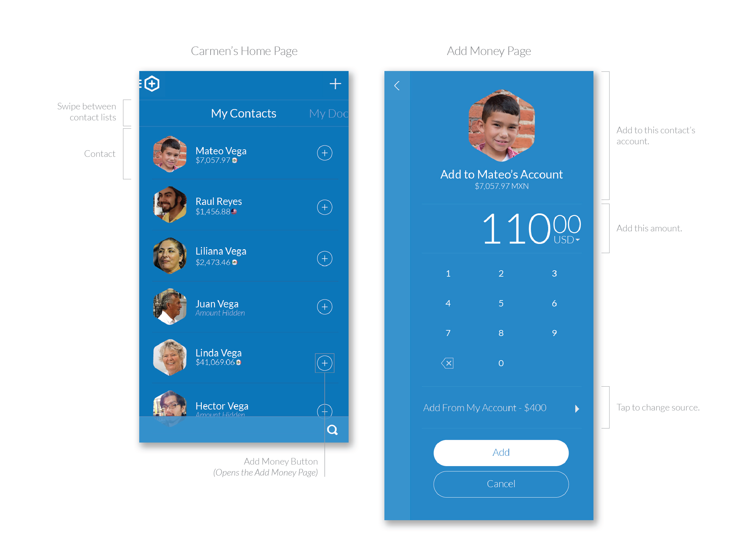
In those thirty seconds, we want Carmen to open the app and allocate small amounts of money to various members of her family. We want her to do this as quickly as possible, so our original designs focused on this page. By tapping easily accessible”+” button to the opening page, she can quickly execute our desired top-level action.

Going Deeper
Much of what we heard from our research was about validation – people need to feel involved and want to know the details about what they’re giving to. Making family members more prominent gave us a natural element that helped us not only organize content, but was familiar thanks to it’s similar appearance to chat interfaces (most importantly, WhatsApp – used by most of our users).
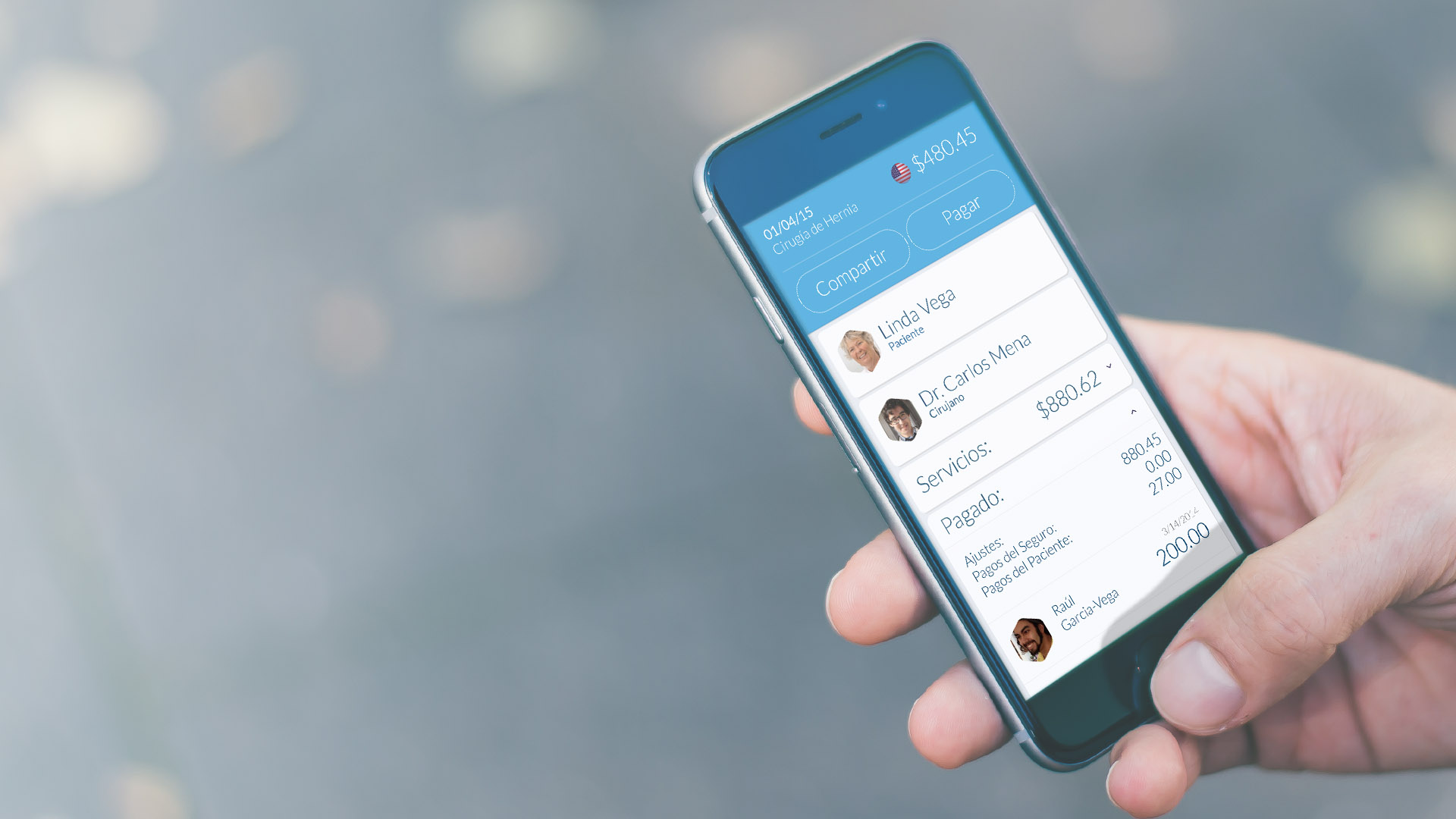
In our Design Research (DR) exercises, “View a transaction history” scored consistently high in participant prioritizations, so our early designs focused on providing “case” information – information about a specific health event – with easy access to a pay button at every level.
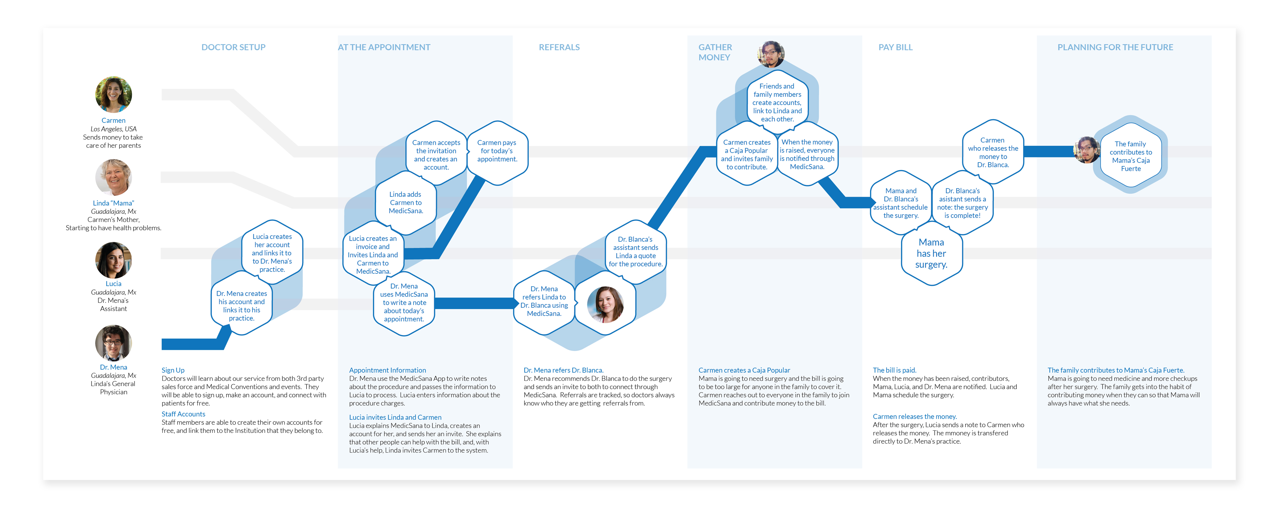
Customer Journey
As I discussed in our Brand Strategy page, it was more important for us to consider the interactions of the group rather than those of one persona. In developing our strategy, therefore, we built a Customer Journey Map that spread across four persona types.
On the next page, see how we mapped this plan to our development and business timelines.