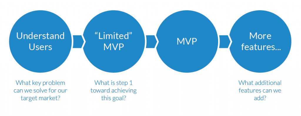
A “Limited” MVP
With our MVP planned, we pitched to group of strategic investors that had technical capabilities in HIPAA compliant data storage and international remittance transfers. It was time to start building.
Many aspects of this application, however, would require coordination with our new partners, so when we received our funding, we broke the development and release of our minimum viable product into two stages. Stage 1 would be a stand-alone app with it’s own value proposition that would enable us to go to market early. Stage II, which required more coordination with our partners, would focus on the transactions that our research participants wanted.
Stage 1 would focus on the skeleton of the system: the ways people connect to one another. Our goal of this phase was two-fold:
- Build a scalable interface system that would support later features without them feeling like “add-ons”
- Enable us to start gaining traction with an app that had value to customers from Day 1. Our goal in Stage I wasn’t necessarily profitability, but market saturation – how can we get users on board and enable them to grow our system organically?

Information Architecture
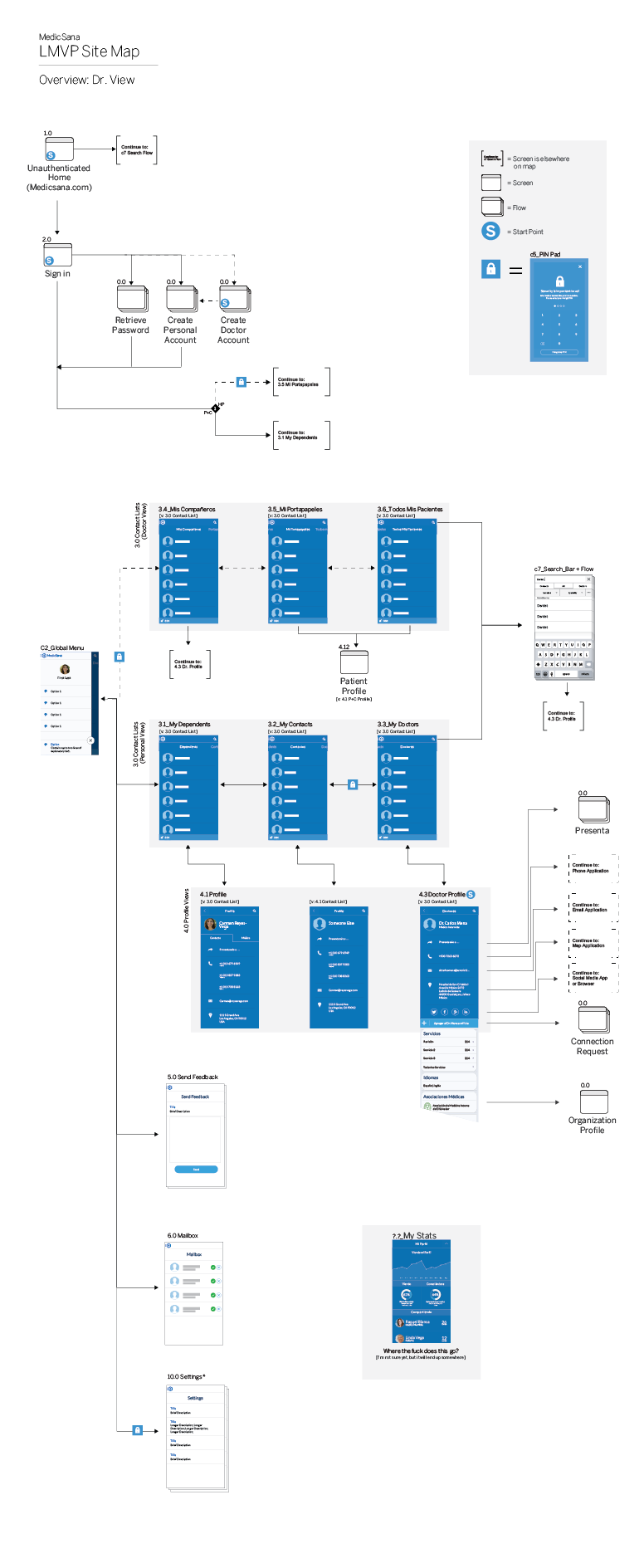
To build a scalable system, we looked a few releases ahead with our architecture. This way, we would be able to push new releases to users without fundamentally changing the display.
![]()
Doctor Finder
Our core demographics for Stage 1 were families and doctors in our initial target market of El Salvador. El Salvador has a huge diaspora population in the US and remittances make up a large part of the country’s GDP. By providing a free app that enabled patients and their families to connect to doctors locally, we could start gaining penetration in the market that would later – through word of mouth – spread it to the US naturally once payment transfers were enabled.
El Salvador has a high crime rate, and extortion is very common – particularly for doctors. Personal referrals are important in any healthcare market, but in El Salvador, it provides assurance not only of quality, but safety.
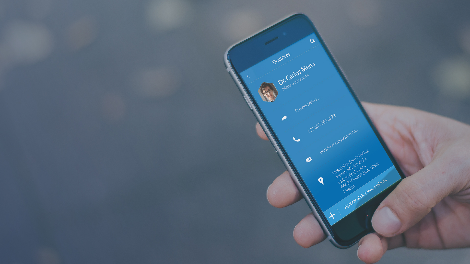
With this in mind, we set about building a doctor directory that enabled users to easily store the contact information for their doctors. Our primary strategic goal, promote organic growth, mixed with our top user insight, “Personal referrals are the most trusted,” added some new experience goals that fit nicely into our end-goal framework. Referrals in our system allowed users to connect to one another based on their user type (Doctor-Patient, etc…) and their familial relationship (brother, sister, cousin, etc…).
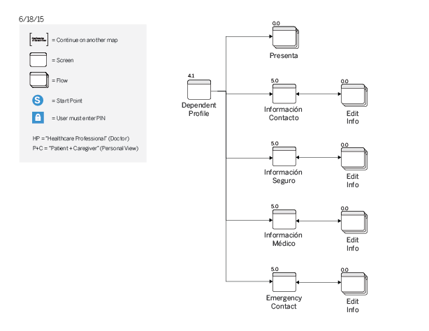
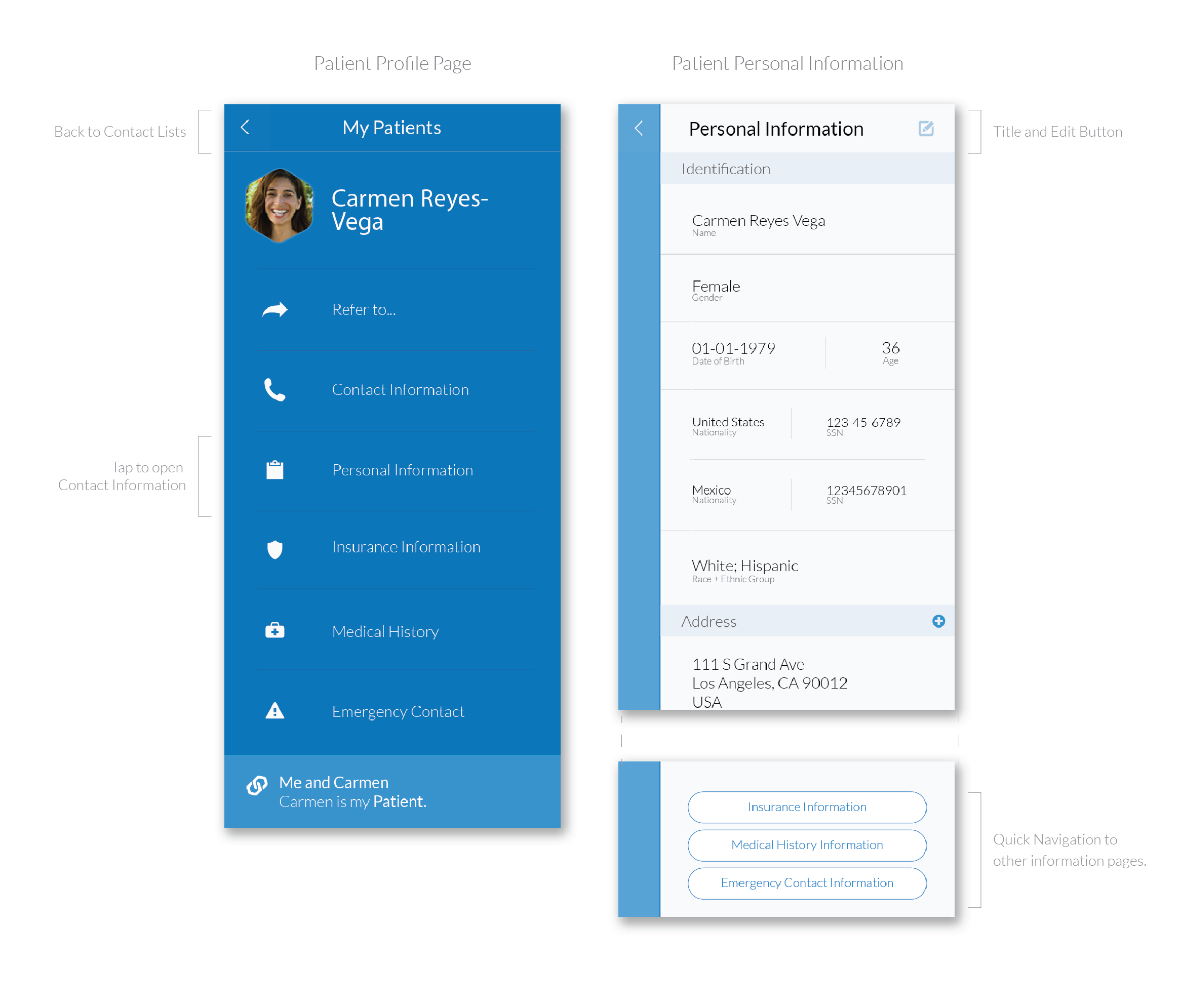
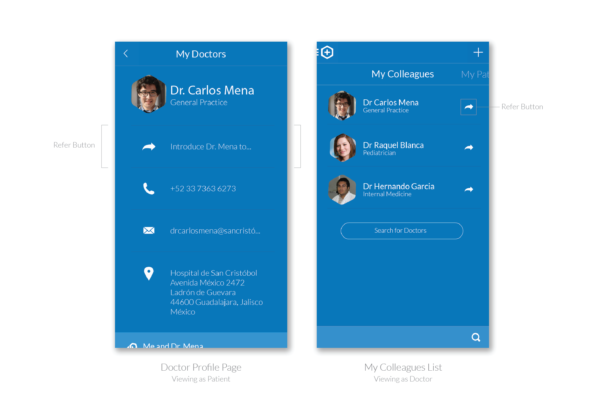
Profiles
The system enables users and doctors to create profiles that could be connected together. Doctors can view personal, contact, emergency contact and insurance information of patients. Patients can search for, view, and save doctor contact and other information.
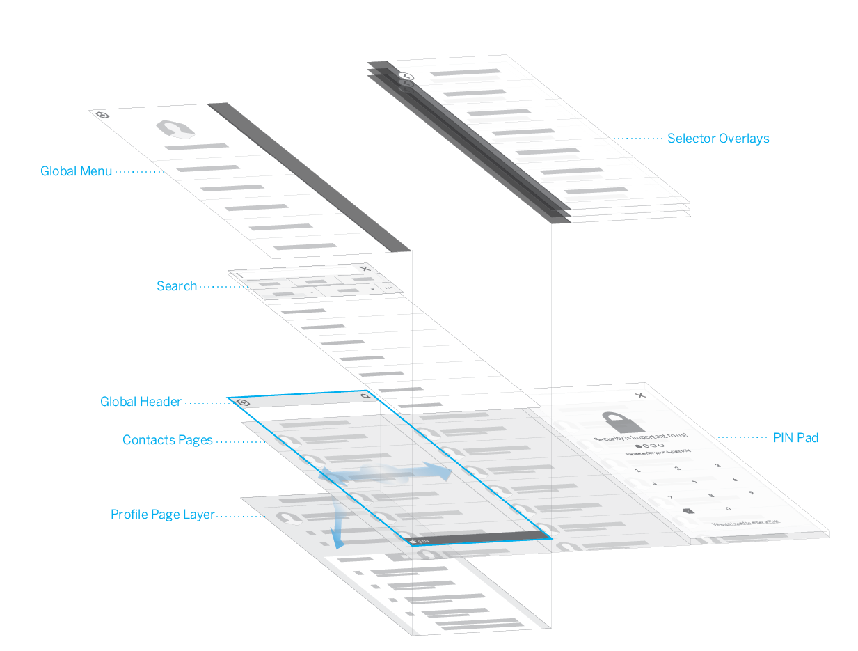
Visually, we used blue to highlight upper-level actions and light grey cards for additional information. On Doctor Profile pages, blue highlights information that may be actionable and important to a patient in the moment, such as a doctor’s office location or contact information (see below).
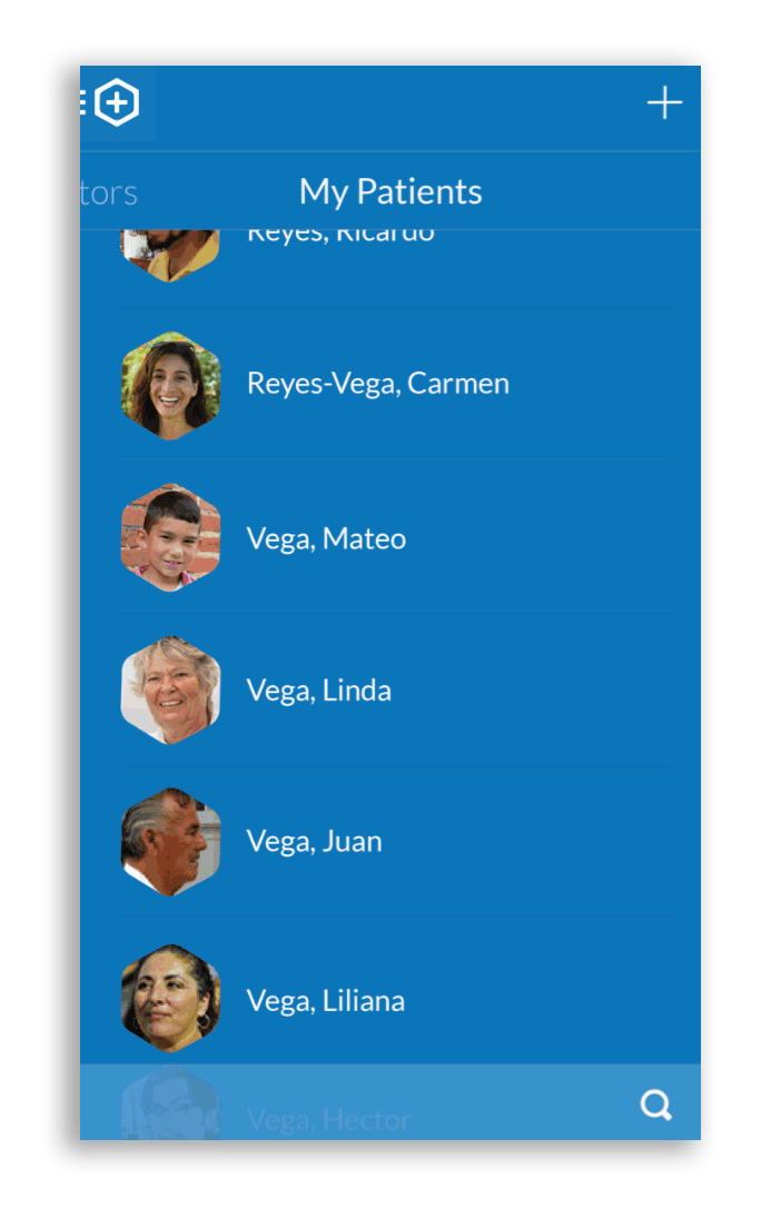
Because patients had a lot of information that doctors wanted to view quickly in categories, we opted for slide out “Selectors” (Click the GIF on the right to view this interaction).
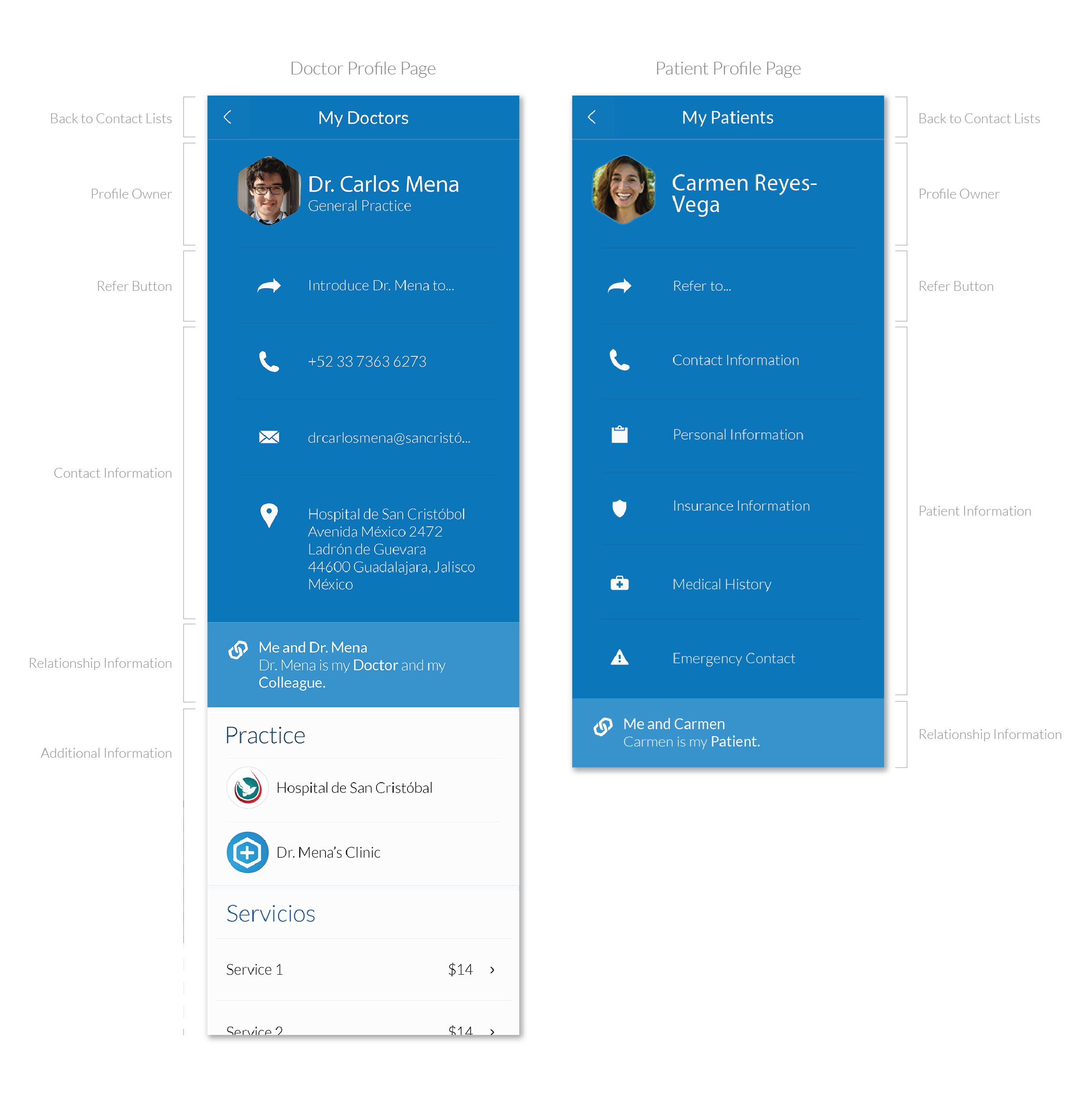
Patient Information
Our longer-term goal was to get people to shift from keeping patient records on paper, or static software like Microsoft Word, onto our a secure, shareable cloud-based solution. While referrals (below) represented a growth strategy for us, both the social network aspect and patient information storage would increase the stickiness of our service.
Most doctors we talked to believed that their solutions worked just fine, and that there would be little advantage for them to pay for a cloud service (though we knew from other interviews that this flexibility would be appreciated by their patients).
We therefore, began to seed a much lighter opportunity to track patient information that could be edited by either the doctor, patient, or patient family member. We believed that, in the same way doctors gravitated to sharing and storing information in WhatsApp or Word through convenience, that coupling this information with referrals – a more enticing offer – would make information storage in our interface a “common sense” decision.
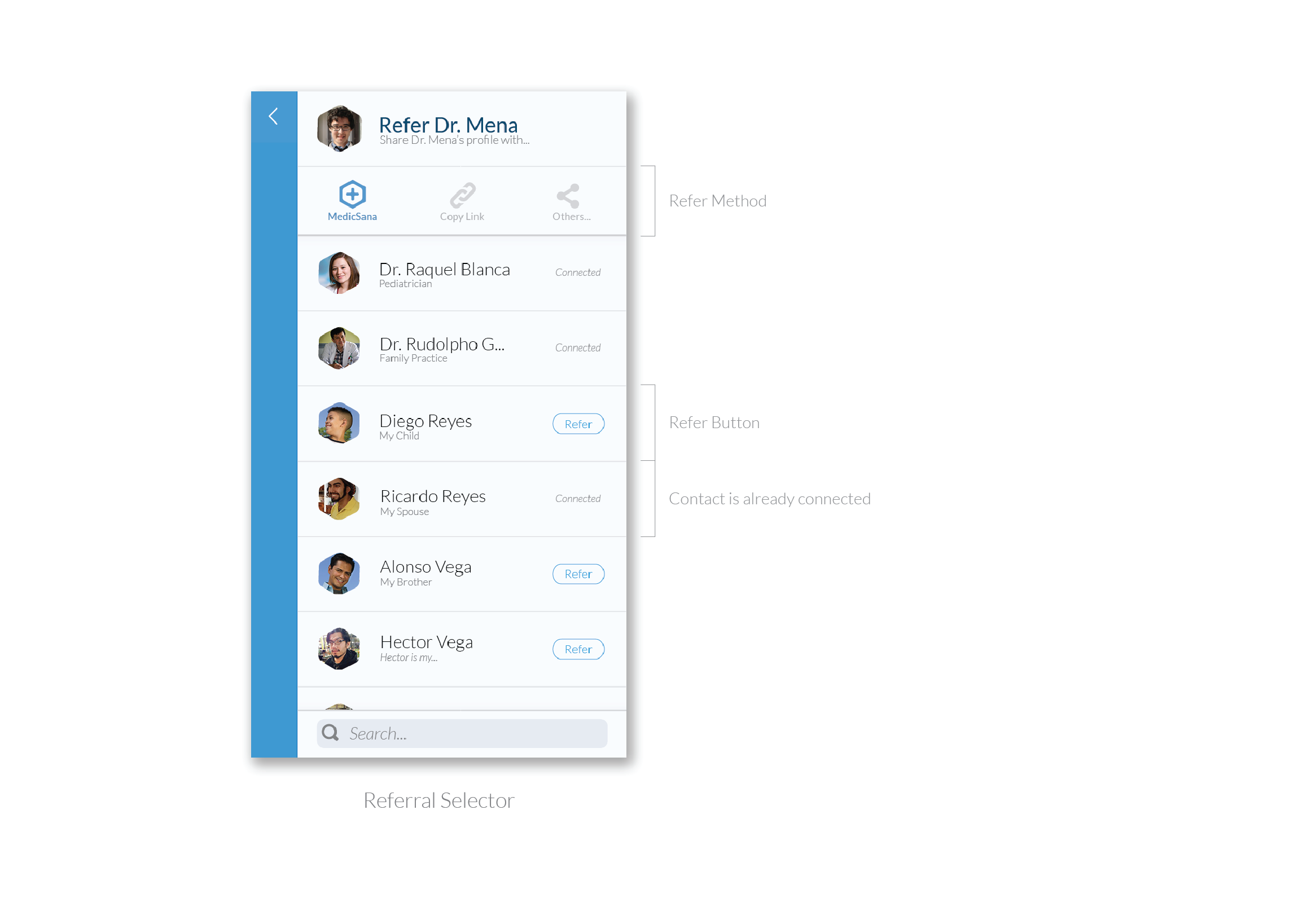
Referrals
From a roadmap perspective, this shifted referral functionality to the top of our backlog, so on the UI side, we promoted referral buttons to primary locations so that doctors could easily refer patients to their colleagues.
Because in the early days our penetration would be low, we also designed an easy way to invite a user to the system by sending a referral. We implemented a common ionic feature that would enable us to send an invitation through any messaging interface on a person’s phone. The recipient can click the link to download the app and a connection will automatically be made once they create an account.
Early Validation
While we were building the first version of the app, we spent time in the field interviewing doctors about future functionality and iteration. At the end of these interviews, we would pull out prototypes or functional builds to get a sense of how we were doing.
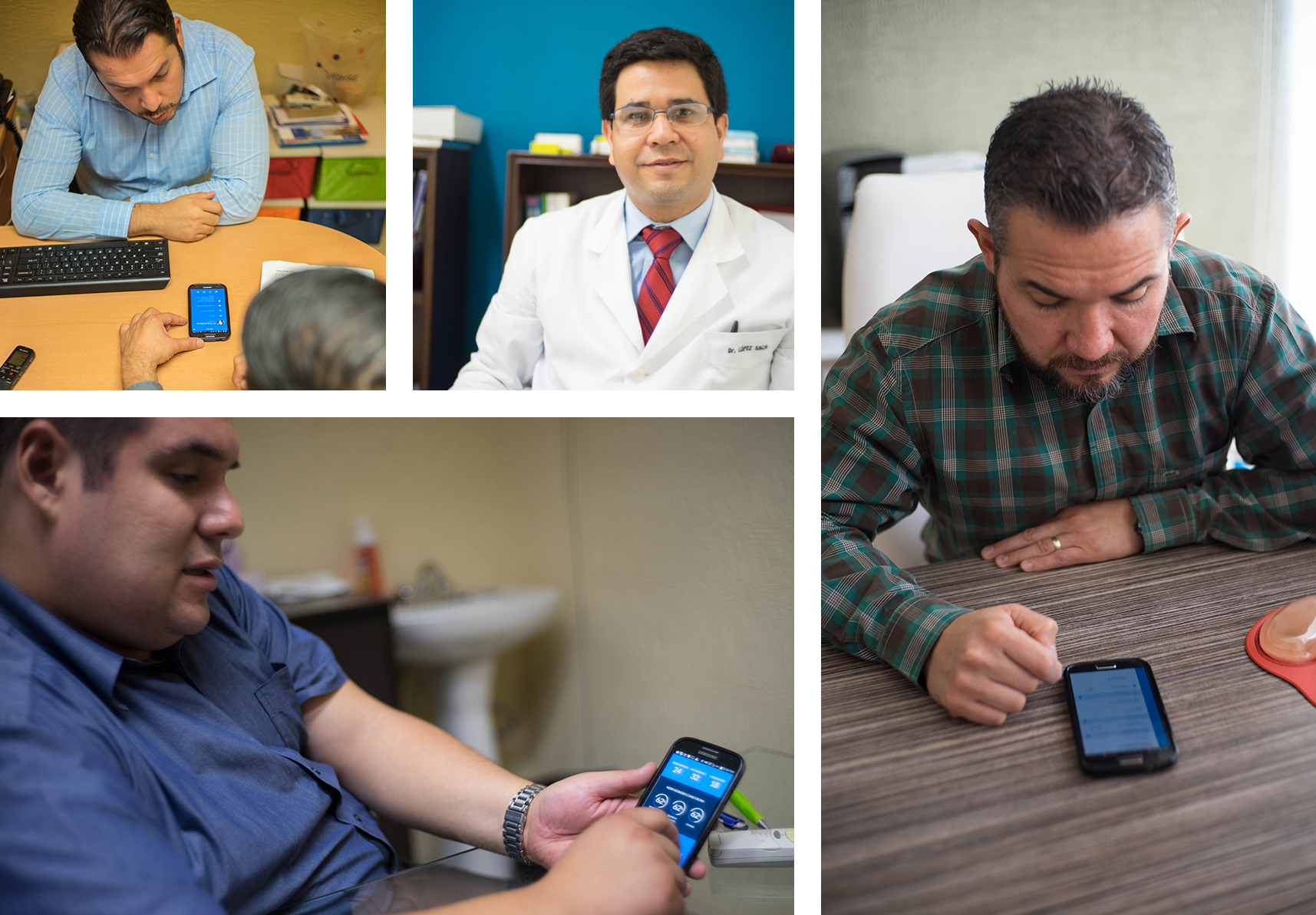
Doctors loved our app design. Most doctors we talked to still used systems like Microsoft Word for patient records (if not paper, which was still the most common) and all of them used WhatsApp for patient communication. The doctors we spoke to simply wanted to avoid the complexity of modern EHR system, which they saw as simple over-kill for that they did day to day.
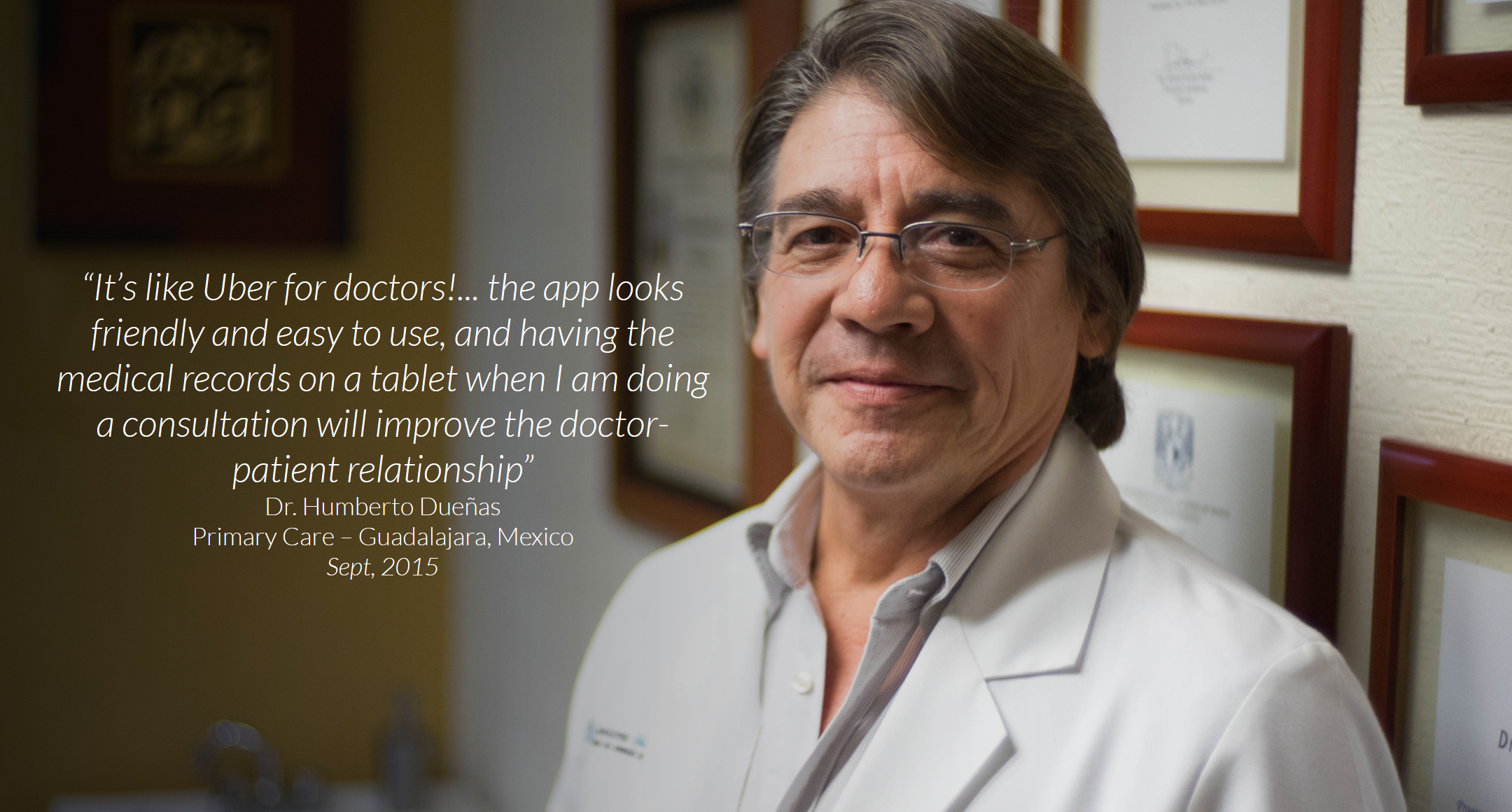
Our app, by contrast, appeared to them to be quite simple and straightforward. Though we had packed a lot of features into our prototypes, the clean design felt simpler and, to them, more powerful. As a selling tool, even our prototypes were enough to get doctors excited enough to offer early sign-ups.
Personal Retrospective
Unfortunately, many of our design and implementation hypotheses went untested in the market. For reasons outside the scope of the product development team, the company was unable to sustain support for the project to make it to our planned Stage II.
In retrospect, as is true at the end of any project, there are things that we would have handled differently. A core issue that plagued the company through it’s short life was an inability to find a partner that enabled payment transactions. We were able to pivot away from this, but I feel that our pivot came a little too late and, for other business reasons, could not be executed quickly enough to be effective.
With the benefit of hindsight, and now a deeper understanding of lean development, my perspective is that a more disciplined approach to an agile framework such as Scrum much earlier in the process may have saved the project. Our research brought us excellent insights, but it took a little too long for the team to gel well enough to weather the business hurdles. Had our process and release cycles been as tight at the beginning of the product as they were at the end, we may have made it to market much faster and potentially started pulling in revenue.
Read More
Read more about the MedicSana project, other design case studies, or more about me on my homepage.